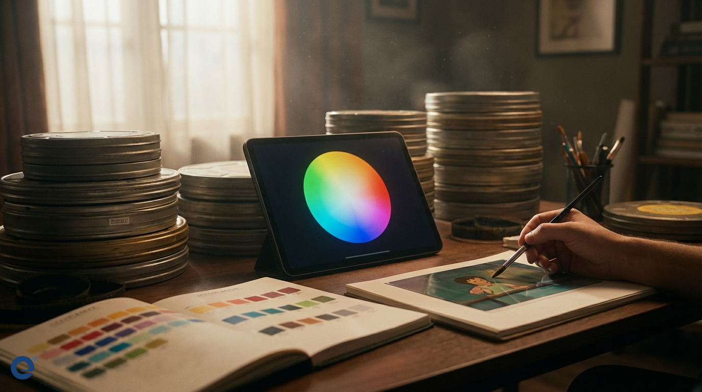
Color is a powerful tool in filmmaking. In animation, it's absolutely vital. Color grading for animated movies is the process of altering and enhancing the color of the footage. This is done for artistic and technical reasons. It helps shape the narrative and evoke specific emotions.
Unlike live-action, animation colors are often chosen before rendering. However, the final color grade is still crucial. It ensures consistency and adds the final layer of polish. Therefore, understanding color grading is key for animators and colorists.
The profound impact of color in animation
Colors speak directly to our emotions. For instance, warm colors like red and yellow can evoke happiness or energy. Conversely, cool colors like blue and green can create a sense of calm or sadness. Animators use this language of color deliberately.
They build color palettes that support the story's themes. Think about the vibrant colors in "Up" during happy moments. Then, consider the muted tones during sadder scenes. This is not accidental. It is carefully planned color storytelling.
The art of color in film is about guiding the viewer's feelings. Animation relies heavily on visual cues. Thus, color becomes a primary narrative device. It can define characters, establish mood, and even indicate changes in time or place.
Understanding the building blocks: Color theory
To effectively grade animation, one must understand color theory. The three main components of color are Hue, Saturation, and Value (or Brightness)[1]. Hue[2] is the pure color itself, like red, blue, or green.
Saturation[3] refers to the intensity or purity of the color. High saturation means vivid colors, while low saturation leads to muted, grayish tones. Value[4], or brightness, describes how light or dark the color is. These elements are fundamental, as detailed in photography color principles.
The color wheel is another essential tool. It helps visualize relationships between colors. Understanding these relationships allows for harmonious and impactful color combinations.
Hue: The color itself
Hue is what we typically think of as "color." It's the dominant wavelength of light we perceive. In animation, the choice of hues sets the initial emotional tone. A scene dominated by blue hues will feel different from one dominated by orange hues.
Saturation: The intensity
Saturation controls the vibrancy. Highly saturated colors can convey excitement, energy, or artificiality. Desaturated colors often suggest somberness, realism, or a dreamlike state. Animators might desaturate a scene to indicate a flashback, for example.
Value: The lightness or darkness
Value affects the mood significantly. High-value (bright) scenes can feel cheerful and open. Low-value (dark) scenes can create mystery, tension, or intimacy. Contrast in value is also crucial for visual interest and focus.
Basic color grading schemes in animation
Color schemes are planned combinations of colors. They help create a cohesive and visually appealing look. Several basic schemes are commonly used.
Monochromatic scheme
A monochromatic scheme uses variations in saturation and value of a single hue. This creates a very unified and harmonious look. It can be very effective in setting a strong, specific mood.
Analogous scheme
Analogous colors sit next to each other on the color wheel. For example, yellow, yellow-green, and green. This scheme is also harmonious and often found in nature, creating a pleasing and calm effect.
Complementary scheme
Complementary colors are opposite each other on the color wheel, like red and green or blue and orange. They create high contrast and can make elements pop. This is often used to draw attention or create visual excitement.
Triadic scheme
A triadic scheme uses three colors evenly spaced on the color wheel. It offers strong visual contrast while retaining balance and color richness. It's vibrant and can be very effective in animation for a lively feel.
Tetradic scheme
The tetradic or rectangle scheme uses four colors arranged into two complementary pairs. This scheme is rich but can be hard to balance. If one color dominates, the scheme can look harmonious.
The animation color grading workflow
Color grading in animation is a multi-stage process. It often begins early and continues through post-production.
1. Color script and look development
Before animation even begins, a Color Script[5] is often created. This is a sequence of images or panels showing the color progression of the film. It maps out the emotional arc using color.
Look Development (Look Dev) follows, where artists define the appearance of characters, environments, and effects, including their base colors and textures under various lighting conditions. This sets the foundation for the final grade.
2. Initial grading and LUTs
As shots are rendered, an initial grade might be applied. Sometimes, Look-Up Tables (LUTs) are used to apply a predefined color look consistently across shots. This helps maintain the intended style.
3. Shot-by-shot grading
This is where the detailed work happens. Each shot is individually color graded to match the color script and ensure continuity between shots. Colorists adjust hue, saturation, value, contrast, and more.
They might use power windows to isolate and adjust specific areas within a frame. For instance, they might brighten a character's face or desaturate the background.
4. Final review and mastering
The director, art director, and colorist review the graded film. They make final adjustments to ensure the colors support the story and look consistent across different display devices. The film is then mastered for various delivery formats.
Tools of the trade
Several software tools are popular for color grading animation:
- DaVinci Resolve: An industry standard for color grading, offering powerful tools and node-based workflow.
- Adobe After Effects & Premiere Pro: These offer integrated color grading tools like Lumetri Color, suitable for many animation projects.
- Nuke (with Nuke Studio): Often used in VFX-heavy animation, providing robust compositing and color tools.
- Autodesk Flame/Lustre: High-end finishing and color grading systems.
- Baselight: Another top-tier color grading system used in feature films.
The choice of tool often depends on the project's scale, budget, and the existing pipeline.
Challenges in grading animation
Color grading animation presents unique challenges. Maintaining color consistency across thousands of frames, often worked on by different artists, is difficult. Different animation styles (2D, 3D, stop-motion) also require different approaches.
For 3D animation, the interaction of light with materials is rendered, but the final grade still needs to unify the look. In 2D, colors are often flat or subtly shaded, so the grade might focus more on overall balance and mood. Stop-motion involves real objects and lighting, but still benefits from a grade to enhance the look and fix inconsistencies.
Rendering can also be a factor. The way colors are rendered needs to be considered during the grading process to achieve the desired final output.
Iconic color use in animated films
Many animated films are remembered for their striking use of color. "Spider-Man: Into the Spider-Verse" is a great example, using bold, comic-book-inspired palettes and even offset printing effects to create a unique visual style, as noted by viewers. The film's colors shift dramatically to reflect different dimensions and character emotions.
Studio Ghibli films, like "My Neighbor Totoro" or "Spirited Away," use color to create breathtaking, immersive worlds that feel both fantastical and grounded. The palettes often emphasize nature and evoke a sense of wonder.
Pixar's "Inside Out" uses color brilliantly to personify emotions, with each emotion having a distinct color signature that visually represents their personality and impact on the story.
The color grader's role
The color grader or colorist is a key artist. They work closely with the director and art director. Their job is to interpret the creative vision and translate it into the final colors of the film.
A good colorist needs both technical expertise and artistic sensibility. They must understand the tools, color science, and the emotional impact of color. They ensure the final look is cohesive and beautiful.
Future trends in animation color grading
High Dynamic Range (HDR) grading is becoming more common. HDR allows for a wider range of brightness and color, offering more expressive possibilities for animation. However, it also presents new challenges in mastering and display.
Artificial intelligence (AI) is also beginning to play a role. AI tools might assist with tasks like color matching between shots or even suggesting initial grades based on a reference. However, the artistic input of the colorist remains paramount.
As animation technology evolves, so too will the art and science of color grading. It will continue to be a vital part of bringing animated stories to life.
More Information
- Hue, Saturation, Value (HSV/HSL): These are three components that define a color in many color models. Hue is the color type, saturation is its intensity, and value/lightness is its brightness.
- Hue: This refers to the pure spectrum colors around the color wheel, such as red, yellow, blue, green, violet, and orange. It's the attribute that allows us to distinguish between these basic colors.
- Saturation: This describes the intensity or purity of a hue. A highly saturated color is vivid and bright, while a desaturated color is dull, muted, or grayish.
- Value (Brightness): This indicates the lightness or darkness of a color. It ranges from black (low value) to white (high value), with the pure hue somewhere in between.
- Color Script: A sequence of small illustrations or color swatches that map out the color and emotional progression of an animated film from beginning to end, scene by scene.